At the end of last year we finally managed to change the IOTIQ corporate design. Green-yellow was turned into blue-orange, we used new, chic fonts and other corporate colors such as various shades of blue and gray. The new look became simple and elegant.
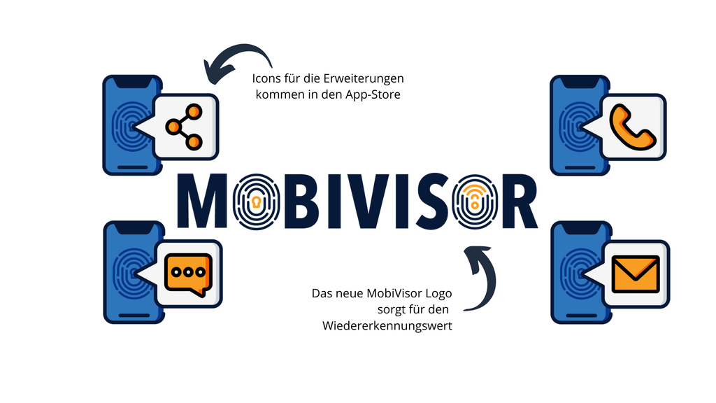
This year it was time to see where we could still make an improvement in the graphical area. The decision was made in favor of the MobiVisor family - in addition to a new website and new products, the design was to be significantly refreshed. We sat down with graphic designer Idil from Turkey, who already created the MobiVisor design in 2017.
Our requirements: Logos and/or icon designs for six different products of the MobiVisor family for website and/or app store, a reference to the IOTIQ colors and a modern interpretation of the old version of the logo.